One of the most common mistakes in UX design is assuming we know what the user needs without truly understanding their experience. To design people-centered products, it isn't enough to know their demographics or usage patterns.
It's essential to understand their mindset, emotions, and motivations.
This is where empathy maps come in.
These tools make it possible to clearly and systematically visualize what a user thinks, feels, says, and does in relation to a product or service. With them, UX teams can gather valuable information that guides design decisions.
Today we'll explore what empathy maps in UX are, their different types, how to build them step by step, and how to analyze them to optimize the user experience.
What is an empathy map, and what is it for?
An empathy map is a visual representation that helps UX designers better understand their users. It's built from information gathered through interviews, surveys, and behavioral studies, and it organizes users' thoughts, feelings, actions, and words in a structured way.
Its main purpose is to make it easier to identify users' needs, frustrations, and expectations in order to design products and services that better match their reality. In other words, an empathy map helps answer questions like:
- What is the user really worried about?
- How do they perceive their problem or need?
- What factors influence their behavior?
- What are their expectations when interacting with a product or service?
Empathy maps are particularly useful in the early stages of the design process, when teams are trying to properly define their target audience and avoid decisions based on assumptions.
Example of an empathy map:
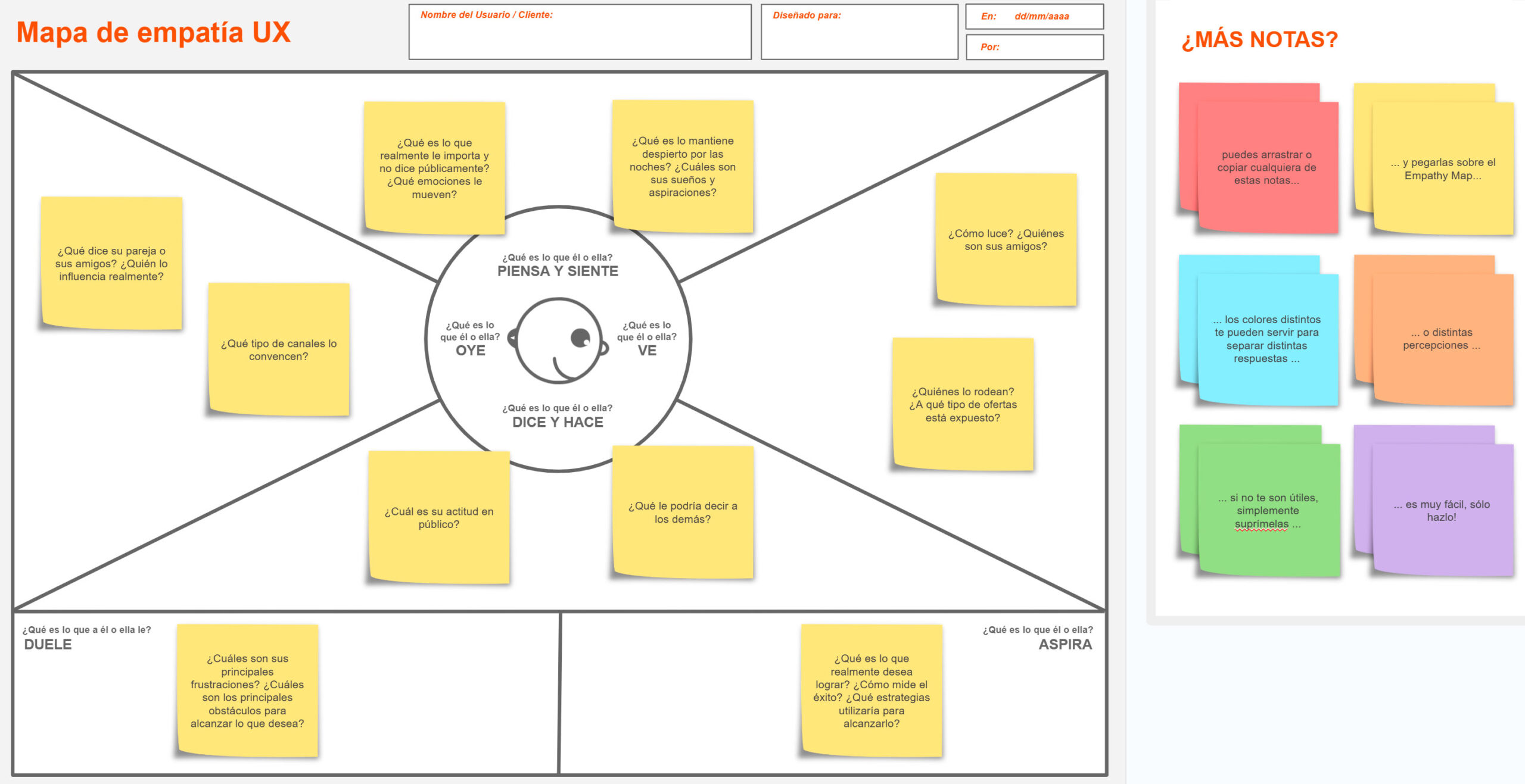
Differences between single-user and aggregate empathy maps
There are two main types of empathy maps:
Single-user empathy map: Built from the information of a single person, based on in-depth interviews or specific studies. This type of map allows for a detailed understanding of one user's individual experience.
Aggregate empathy map: Built by combining insights from multiple users who share similar characteristics or behaviors. It's useful for identifying patterns and trends within a group of users.
A single-user empathy map is ideal when you want to dig deep into one specific person's experience, while an aggregate map is useful when trying to represent a broader audience.
Steps for building an empathy map
Creating an effective empathy map requires gathering qualitative information and organizing it into key categories. Follow these steps to build one efficiently:
1. Define the user or group of users
Before you start, you need to determine who the map is being built for. It could be an individual user (if based on a specific interview) or a group with shared characteristics.
2. Gather information
For an empathy map to be useful, it must be based on real data. Some recommended sources include:
- User interviews
- Usability testing
- Open-ended surveys
- Behavioral analysis of digital products
The goal is to gather genuine information about what users say, do, think, and feel when interacting with a product or service.
3. Divide the map into sections
The empathy map is organized into four main quadrants:
🔹 SAYS: What does the user express verbally? This includes literal quotes gathered from interviews or surveys.
🔹 THINKS: What are their internal thoughts? This captures ideas, concerns, and motivations that may not have been directly expressed.
🔹 DOES: What actions does the user take? This documents their habits, interactions, and observed behaviors in the context of using the product.
🔹 FEELS: What emotions do they experience? This includes feelings related to frustrations, expectations, or satisfaction while using the product.
4. Fill in each section with real insights
Each quadrant should be filled with information based on user research. It's important to avoid subjective interpretations and focus on objective data.
Example of what a basic empathy map might look like:
| THINKS | |
|---|---|
| SAYS | "The site's navigation confuses me" |
| DOES | Tries several times to find an option, but gets frustrated and gives up |
| FEELS | Frustration at not being able to complete the task easily |
This format makes it easy to quickly visualize the user's pain points and needs.
5. Analyze and draw conclusions
The final step is identifying patterns and trends across the empathy maps created. Key questions for the analysis include:
- What are the most recurring problems users mention?
- What expectations or desires seem to be shared?
- Are there contradictions between what the user says and what they actually do?
This analysis makes it possible to make informed decisions to improve the user experience.
Practical application example
Imagine a design team is building a digital banking app. Through interviews, they discover that many users feel unsure when making transfers because the interface isn't clear.
The team builds an empathy map based on these findings:
| THINKS | |
|---|---|
| SAYS | "I'm not sure if the money went through" |
| DOES | Checks the transaction several times, looks for help in forums |
| FEELS | Anxiety at not receiving immediate confirmation |
This empathy map helped the team identify the need to add real-time notifications and clearer confirmation messages.
How to analyze results to improve UX
Empathy maps aren't just visualization tools — they serve as a foundation for improving the user experience. Some ways they can help include:
- Identifying areas for improvement in the interface: If many users express confusion about the same point, that's a clear sign the design needs adjustments.
- Discovering new design opportunities: If users show a recurring, unmet need, a new feature can be developed to address it.
- Validating design decisions: Before implementing changes, empathy maps can serve as a reference to make sure they're aligned with user expectations.
What to avoid when creating empathy maps
While empathy maps are powerful tools, it's easy to make mistakes when creating them. Some of the most common include:
Relying on assumptions instead of real data: An empathy map is only useful if it's based on genuine research, not the design team's personal opinions.
Not updating the map over time: Users' needs and behaviors change. It's important to review and adjust empathy maps periodically.
Not connecting insights to design: An empathy map isn't just a visual exercise; it needs to translate into concrete actions within the design process.
Empathy maps as a key to user-centered design
Empathy maps in UX are an essential tool for understanding users from a deeper, more humanized perspective. They don't just help visualize their thoughts and emotions — they also provide key information for designing more intuitive and effective products.
When used correctly, they allow design teams to make informed decisions, reduce friction in the user experience, and build products that genuinely solve problems. Integrating them into the design process isn't just a good practice — it's a fundamental step toward creating digital experiences that are more satisfying and better aligned with people's real needs.